Do you think that the Spotify Logo is essentially green? Do you feel that the logo personifies the color green?
Wherever you look, a darker shade of green is ought to remind you of the quirky (yet minimal) Spotify logo. It is one of the most minimalist logos of the digital era. The tilted logo with asymmetrical lines enclosed within a dark-green background has become the global emblem of music. But, where did the Spotify logo come from?
Presently, Spotify is one of the largest online music streaming platforms. With millions of users and creators hooked on the platform, Spotify has a value of $22.95 Billion within the market space. Since the platform’s inception in 2006, the logo has undergone several modifications and alterations.

The Start point of the line
Spotify was launched on 23rd April 2006. It was founded in Sweden by Daniel Ek and Martin Lorentzon. The company’s title was initially misheard from a name shouted by Lorentzon, which they later thought out an etymology of a combination of ‘spot’ and ‘identify’.
The original logo made its debut in 2008. Over the years, it has undergone several modifications to become what it is today.
The 2008 OG
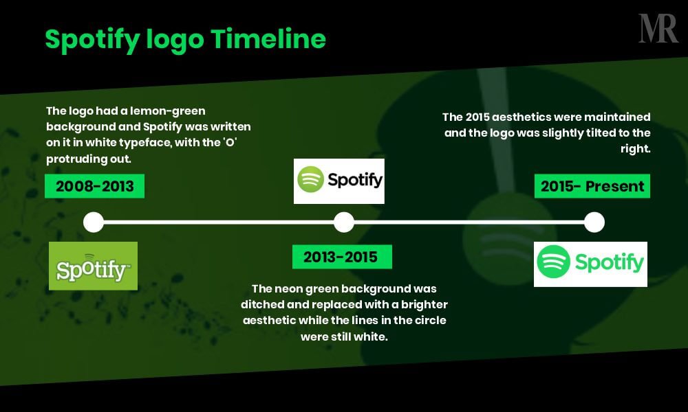
The first Spotify logo was very simple and minimal. Its style was similar to that of the emerging tech companies launching in the 2000s—used fun fonts with minimalistic elements. The original logo is a white typeface on a lemon or avocado-green square background.
- The white typeface had a clear outline.
- The boundary square had round edges with ‘Spotify’ written along its base.
- The name appeared like a flowing or dancing style, with the letter ‘O’slightly raised up.
- The three stripes above the letter—O with different weights—represented a Wi-Fi icon or the sound of music.
The 2013 Overhauling
In 2013, the logo was entirely redesigned. The trademark had its first major overhaul, where both the rectangle of the green background and the funky ‘O’ in the wordmark were removed. Around that time, several companies were modernizing their logos to make them appear sleeker and simplified—something which was also reflected in the Spotify logo. IP attorneys in Sydney can help you navigate tricky trademark issues if you need them.
- The logo’s font was changed to a simple sans-serif one in thick black font.
- A series of three curved white lines in a green circle was placed next to the icon.
- Once again, the lines represented the synergy between internet connectivity and music in the Spotify business model.
Goodbye to Neon Spotify Logo in 2015
Just 2 years after the recent rebranding, Spotify changed its logo, yet again, in 2015. This time, the logo adopted brighter aesthetics—bidding goodbye to the Neon logo. With the iconic change, the company transformed the fundamental color of its brand.
Initially, Spotify’s choice of shades for its logo was more connected to nature than technology. In its new logo, other elements of the previous aesthetics remained the same.
- The lines in the circle were still white.
- The accompanying font is still sans-serif.
- The background had a matching neon green shade.
The Present Green Aesthetics
Since 2015, the Spotify logo has remained intact. If you look closely at the Spotify logo, you will notice that it is slightly tilted to the right. There are, however, various answers to why the company chose this particular aesthetic. Some believe that the crooked design was meant to make the brand appear more human, whereas others say that the crooked Spotify logo tilted slightly towards the right to demonstrate the forward-moving nature of the company and the music industry.

Break-down of the Spotify Logo Controversy
In 2015, dozens of complaints surfaced over the web when Spotify changed its logo from normal pea-green to neon-green color. The latest green color looked similar to the color of the iPhone battery-charging icon. As a result, ‘Spotify green’ began trending on Twitter by those angered by the logo change. Moreover, several Spotify users threatened to delete the app. Despite the lurking controversies, Spotify retained its logo and the old shade still shows up on the desktop version of the app and the company’s older website pages. However, the new logo is present on the first page of the Spotify website and the official Spotify Twitter page.
Breaking down the Spotify emblem
The meaning of the Spotify logo varies according to the perspective of people. According to some, its design represents sound waves and wifi or internet connectivity.
- The curved lines are similar to the shapes used by most companies to depict connectivity in the past. Nevertheless, the decision to curve the lines slightly towards the right may be a deliberate one, showing the forward-thinking nature of the company.
- Using a circle is a common trait among digital companies for creating a sense of community via their logo. Similarly, Spotify works on the same principle— “Circles convey connectedness and inclusivity.” However, the circle can also represent the world, meaning that the Spotify logo highlights its global reach and ability to access various kinds of music.
- Using green as a central color can suggest that Spotify wanted a connection with ideas of growth, and creativity. It was an uncommonly used shade associated with tech companies until Spotify was launched. Green can also represent nature, so this may be why Spotify chose a more unnatural green for later versions of the logo, to separate itself from this meaning.
How does Spotify stand out with its Logo?

Spotify stands out with its brilliant logo. The logo is minimal yet artistic. It is one of the best logos within the digital space as it is simple, memorable and eye-catching. From the unique green shade to the choice of font, the Spotify logo with its fewer graphic elements qualifies as modern and minimalist—making it quite ahead of its time. Additionally, the green shade gives it balance and clarity.
When companies like Spotify undergo logo changes, the involvement of trademark attorneys becomes crucial. These legal professionals help ensure that any new branding or logo modification complies with trademark laws, protecting the company’s intellectual property rights.
The minimalism of the Spotify logo makes it versatile and scalable on all advertising platforms. Despite undergoing various modifications in the past few years, Spotify has maintained its fundamental tone through every change.


