A wardrobe often sets the visual tone of a bedroom before paint colour, lighting, or bedding gets any attention. Sliding doors save floor space, yet weak detailing can make the whole setting feel poorly resolved. Low-grade units rarely look disappointing for one single cause. More often, several small faults gather in plain sight. Once we recognise those signs, we can assess quality more easily, reject weak choices, and shape a room that feels settled.
First Impressions
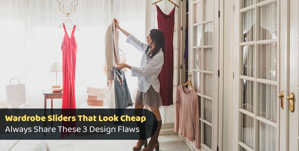
Most people judge joinery within seconds of entering a room, and that first reading usually lands on lines, spacing, and surface balance. In that quick visual check, wardrobe sliders should appear integrated with the wall rather than inserted late. If frames look oversized, tracks sit proud, or panels drift out of level, the eye reads poor value before a hand reaches the door.
Flaw 1: Thick, Clumsy Frames
Heavy framing is one of the clearest signals of a cheap-looking slider system. Slim borders usually feel quieter because the panel surface holds visual focus. Broad rails upset that balance. They also reduce the visible area of glass, mirror, or board. In a compact bedroom, extra bulk can make storage appear dated, crowded, and harder to relate to nearby cabinetry, trim, or shelving.
Why Proportion Matters
Proportion is not guesswork. It can be judged against skirting, interior doors, shelving edges, and ceiling lines already present in the room. If stiles look much thicker than those nearby elements, the wardrobe starts to feel visually disconnected. Balanced sliders repeat existing geometry instead. That quiet rhythm helps the installation sit comfortably. Cheap systems often ignore scale, which leaves the whole opening looking awkward and less resolved.
Flaw 2: Visible Gaps and Poor Alignment
Uneven spacing lowers perceived quality rapidly. Irregular shadow lines at the head, jambs, or meeting edges suggest rushed measuring or weak fitting. A narrow gap on one side and a broader gap opposite will always attract notice. Even costly materials lose impact once alignment slips. Human vision detects crooked geometry with unusual speed, especially in bedrooms where long, uninterrupted surfaces make every inconsistency easier to spot.
Small Gaps, Big Effect
Many buyers notice colour first, yet fit usually shapes value more strongly. Tight, even clearances create order. Loose joints create visual noise. Panel faces should also sit on one plane without a leading leaf jutting forward. That detail affects reflections, edge shadows, and the sense of precision. Cheap-looking wardrobes often fail at this stage before hardware, finish, or board quality can be assessed.
Flaw 3: Weak Track Design
Track design can undermine the full installation, even when the panels themselves appear acceptable. Exposed channels that trap dust feel low-grade rapidly. Noisy rollers send the same signal. Better systems move quietly and sit neatly inside the opening. If the track reads like an added strip rather than a built-in component, the wardrobe starts to seem temporary, light-duty, and visually separate from the architecture around it.
Surface Finish Tells the Truth
Finish quality often exposes value more clearly than style. Thin laminate, hazy mirror, and glossy plastic trim reflect light unevenly. That patchy response makes surfaces seem flimsy. Stronger finishes hold a steadier tone across the full panel. Consistency matters here. If one leaf looks warmer, shinier, or darker than the next, the wardrobe immediately reads mismatched. Small tonal shifts can cheapen the entire wall in a very noticeable way.
H3: Material Pairing
Material pairing works best with restraint. Mirror can sit well in a bedroom, yet a mirror besides imitation timber grain and bright chrome often feels restless. Matte board with a subtle frame usually appears pricier because each element supports the next. Cheap styling often relies on too many finishes at once. Simpler combinations tend to age better, photograph better, and remain easier to place with changing bedding or furniture.
Hardware Should Stay Quiet
Handles, finger pulls, and soft-close parts should support the design rather than dominate it. Oversized pulls can make doors feel commercial instead of refined. Rattling rollers weaken the experience further. Quiet movement suggests care in selection and installation. Sound matters because people assess quality with their ears as well as their eyes, especially in bedrooms where calm daily use carries practical value and contributes to a more settled atmosphere.
Conclusion
Cheap-looking wardrobe sliders usually share the same pattern of faults: bulky frames, uneven gaps, and poor track detailing. Surface inconsistency and noisy hardware often make the effect stronger. None of these issues are difficult to recognise, yet each one changes how a bedroom is perceived. Better results usually come from proportion, alignment, and restraint. Once you handle those basics well, the wardrobe looks quiet, fitted, and far more refined.