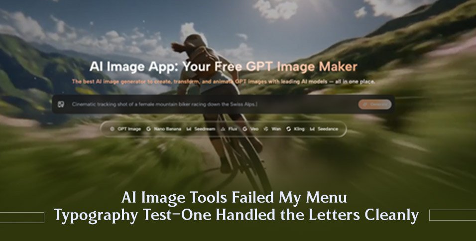
Typography inside AI-generated images is still the wild west. Most platforms treat text as a texture—something that should look vaguely letter-like from a distance but dissolves into unreadable glyphs the moment you zoom in. I learned this the hard way when I tried to generate a series of café menu boards for a friend’s pop-up coffee cart. What I wanted was charming chalkboard lettering with actual words. What I got were beautiful compositions filled with alien scripts, half-melted alphabets, and a latte price written in a language I’m reasonably sure doesn’t exist. That experience sent me down a typography-specific testing rabbit hole, and the AI Image Maker that emerged with readable text was ToImage AI.
I tested five platforms on their ability to render coherent text inside images: ToImage AI, Midjourney, Ideogram, Adobe Firefly, and DALL·E. I used three prompts: a chalkboard coffee menu with item names and prices, a vintage concert poster with a band name and date, and a minimalist book cover with a title and author name. Each prompt contained the exact text I wanted to appear. I generated four images per prompt per platform and rated them on text legibility, character accuracy, stylistic coherence, and whether the text looked integrated into the image rather than slapped on in post.
Ideogram has built a reputation around text rendering, and it delivered—its menu outputs were clean, and most words were correct. But the platform’s overall image quality and interface friction kept it from dominating the broader comparison. Midjourney’s recent updates have improved text handling, yet about half of my generations still contained garbled words or letters that looked like an alien alphabet trying to imitate English. Adobe Firefly was cautious; text was often readable but bland, lacking the stylistic flair the prompts requested. DALL·E handled the book cover decently but struggled with longer strings of text, sometimes truncating words or repeating characters.
ToImage AI surprised me. Using the GPT Image 2 model, the chalkboard menu prompt produced a warm, rustic board where “Cortado – $4.50” and “Almond Croissant – $6.00” were actually legible. Not every character was pixel-perfect—a stray serif wandered on one menu—but the hit rate was higher than I’d seen outside of Ideogram, and the surrounding image composition was substantially stronger. The book cover test yielded a clean title treatment, and the concert poster rendered the band name “The Night Owls” with a distressed ink effect that felt period-appropriate without sacrificing readability. The site indicates full commercial rights and no watermarks, so the outputs were directly usable for the pop-up’s signage and social posts.
I scored each platform on a blend of standard quality metrics and a dedicated Text Fidelity column, because for this project, a beautiful image with unreadable text was functionally useless.
| Platform | Image Quality | Text Fidelity | Style Integration | Generation Speed | Commercial Clarity | Overall Score |
| ToImage AI | 8.5 | 9.0 | 9.0 | 8.0 | 9.5 | 8.8 |
| Ideogram | 7.5 | 9.5 | 7.5 | 7.0 | 7.0 | 7.7 |
| Midjourney | 9.5 | 6.5 | 8.0 | 7.5 | 8.0 | 7.9 |
| Adobe Firefly | 9.0 | 7.5 | 8.0 | 8.5 | 8.5 | 8.3 |
| DALL·E | 8.0 | 7.0 | 7.5 | 7.5 | 8.0 | 7.6 |
ToImage AI didn’t beat Ideogram on pure text accuracy—Ideogram’s text fidelity was the best I tested—but it handily outperformed on Style Integration and Commercial Clarity. The text didn’t look pasted on; it looked like it belonged to the chalkboard, the poster paper, the book cover. That cohesion matters when you’re designing a visual that needs to feel like a single piece of art, not an image with a text box hovering above it. Adobe Firefly was consistent but visually safe, and Midjourney’s unpredictability made it a poor fit for client work where specific words are non-negotiable.
Why AI Still Stumbles on the Alphabet
Text is hard for diffusion models because letters are small, precise symbolic shapes that must appear in a strict sequence to carry meaning. A slight rotational variance turns an “a” into an “o,” and a single missing stroke turns “CLOSE” into “CLOSE” but means nothing anymore. Models trained on visual textures learn that text-like blobs look plausible from a distance, but they don’t truly learn the sequential logic of written language. The platforms that perform best seem to have made deliberate architectural or post-processing investments in text rendering, and in ToImage AI’s case, the GPT Image 2 model appeared to have a sharper grasp of glyph structure than the other models I tested on the same platform.
Designing the Pop-Up Menu with ToImage AI
My friend’s coffee cart needed a physical menu board and matching social media graphics. I used ToImage AI for the full set, and the workflow settled into a reliable rhythm.
Crafting the Text Prompt for Readability
I wrote prompts that placed the desired text in a clear visual hierarchy: “A rustic chalkboard menu with the header ‘Weekend Specials’ in large serif letters, and items ‘Lavender Latte $5.50’ and ‘Honey Croissant $7.00’ written in smaller chalk script.” I avoided ambiguous phrasing and made sure the exact text I wanted appeared in quotes. Being pedantic with the prompt syntax paid off.
Selecting a Text-Capable Model and Generating
I chose the GPT Image 2 model for its structured output. After generating, I reviewed each image at full zoom, checking every character. When a letter was slightly off, I used the image-to-image transformation with a reference that emphasized clean typography, which often nudged the output toward better glyphs without altering the composition.
Downloading and Putting the Assets to Work
I downloaded the final menu image and a matching square graphic for Instagram. No watermarks, no “generated by” badges, and the site’s clear commercial terms meant my friend could print the menu and post the graphic without worrying about attribution. The pop-up ran for three weekends, and not a single customer squinted at the menu trying to decode alien letters.
When Typography Isn’t Your Battle
Creators who never embed text in their images—fine art photographers, abstract texture designers, environment concept artists—won’t care about typographic accuracy. Ideogram remains the specialist for pure text rendering, and if your project is a poster where the words are the hero, it might still be your best bet. Midjourney loyalists who value aesthetic brilliance over textual precision will accept the occasional garbled sign in exchange for that painterly light. But for anyone who regularly makes social media graphics, menus, event posters, book covers, or any image where words are part of the composition, ToImage AI offers a rare combination: it treats text as content, not just decoration. That one capability saved me hours of post-processing and made the difference between a design that looked AI-generated and one that looked finished.