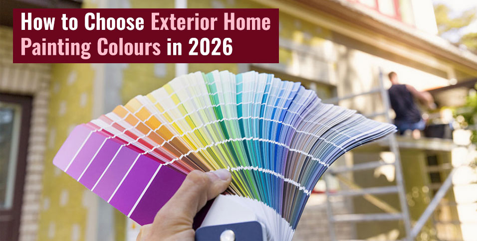
Buying a home is a landmark in a lot of people’s lives, but it’s not just about purchasing the property; it’s also about making it feel uniquely your own. Of course, interior design is perhaps the most important thing about putting your stamp on a property. However, it’s also important to remember that personality starts from the curb, which is why it’s also great to invest in exterior home painting.
But colour psychology isn’t always the easiest thing to manage aesthetically, especially when presenting to your neighbours. The best exterior colours for home facades aren’t likely to be the same as those that populate a property’s insides. This article offers some guidance for choosing the colours that your home expresses to the world, so you can feel confident in everything from the paint on the walls to your decorative elements.
The rule of three in home exterior paint design
The best-looking home exterior colour schemes come in the rule of three, with a clear hierarchy that creates visual interest and depth.
- A dominant colour should be used to set the temperature of the house, used across the siding and masonry.
- Your accent colour is used for the trim, window frames and roofline to provide a pleasant sense of contrast. Accents are often deep charcoal, forest green or plain white as these are effective contrast tones.
- Your front door colour should pack a punch, with the option to take a bit more of a statement colour. Thankfully, lots of contemporary front doors are available in a wide variety of different colours and tones.
Following the rule of three is an easy way to structure exterior colour ideas for homes.
Working with your fixed exterior elements
Short of full renovations, most homes will have a solid base of fixed exterior elements, which are great for focusing on as your anchoring colours. For example, the roof and its tiles can significantly influence how you approach other colour integrations.
- Red clay tiles are often complemented by warmer earth tones.
- Grey slate tiles offer more flexibility with exterior home painting.
Similarly, you should pay attention to the bricks that you’re working with. You might have yellow-stock, red-multi or blue-grey bricks, which should help determine the undertone of the paint you choose.
Exterior home painting based on property era
The UK has a wide variety of different eras represented in its property market, which can help guide your home exterior colour ideas.
- Georgian era homes generally come with muted, natural mineral exteriors.
- Victorian homes oscillate between earth tones and deeper, richer colours.
- Edwardian properties use natural colours, but generally in lighter tones.
- Dominion and bungalow homes generally use cream and white bases.
- Mid-century and modern homes can be brighter, in pastel and natural tones.
Remember, these are just guidelines and (depending on where you live) you have every right to colour homes of any era in whatever way you see fit.
Consider how your home reacts to natural light
It’s always important to remember that paint looks different in the light of day when compared to the image on the can.
- North-facing homes receive cool, bluish light that doesn’t work well with cooler, more grey-leaning tones.
- South-facing homes get warm, intense light, which can boost bolder colours but fade out darker colours faster.
Make sure that your exterior home painting efforts are suited to your natural environment.
It’s not all about keeping up with exterior home colour trends popular in the UK, it’s also about choosing your paints practically to suit your home’s design era and connection to natural light. With these guidelines, you should feel more confident plotting a colour scheme that makes your home feel distinctly you from the moment you lay eyes on it.