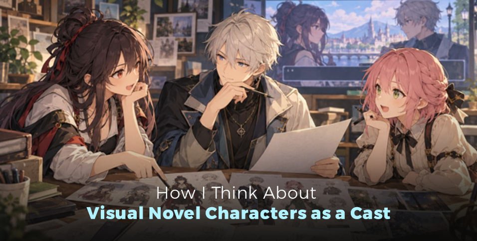
I’ve worked on visual-novel character concepts alongside other OC-focused projects, including anime-couple images and character briefs intended to become prompt-ready visual directions. Those projects have made me think about characters in relation to one another, not only as separate portraits.
That distinction matters in a visual novel. The player usually encounters characters through a scene: someone speaks, someone reacts, and the framing directs attention. A character design can be appealing on its own and still leave the scene unclear if the posture, gaze, or expression doesn’t support the interaction.
When I’m turning character notes into visual directions, an OC maker can help me examine whether the written brief is specific enough to suggest a coherent design. I don’t expect an image to answer the story questions for me. I use the visual direction as a reference and return to the notes when something feels disconnected.
I build the character brief around story information
In my character-planning work, I’ve organized notes around role, setting, behavior, dialogue, silhouette, and props. I like those categories because they keep the brief connected to the character’s purpose. A list of colors and clothing styles may describe a look, but it doesn’t necessarily tell me why that character belongs in a particular scene.
The role gives me a reason for the character to appear. The setting helps define what belongs around them. Behavior and dialogue give me a sense of how they might act in the moment. Silhouette and props provide visual information that can help distinguish them from the rest of the cast.
| Note in the brief | How I use it |
| Role | To understand what the character contributes to the story |
| Setting | To keep the design connected to where the character appears |
| Behavior | To move beyond static personality labels |
| Dialogue | To consider how the character communicates |
| Silhouette | To make the design easier to distinguish |
| Props | To connect visual details to context |
I don’t need every brief to be long. I need it to be usable. If I write that a character is “mysterious,” for example, I still need to decide what that means for the image or the scene. Otherwise, the word may sound descriptive without helping me choose an expression, pose, or visual anchor.
That is where I try to resist piling on adjectives. More words do not automatically mean more direction. I would rather have a short note that explains a character’s role and one or two relevant visual decisions than a long string of generic traits that could describe several characters in the same cast.
Pair work taught me to review the space between characters
I’ve worked on anime-couple concepts involving pose, style direction, variations, and composition. When I review those images, I look at the faces, hands, relative scale, and eye direction. Those details affect how the pair reads together. They can make two characters feel engaged with one another—or make them seem like separate portraits placed in the same frame.
That experience carries over naturally to visual-novel character planning. A conversation scene has a relationship between the people in it, even when the relationship is tense, awkward, or distant. The image has to give the player enough visual information to understand where attention is going.
I don’t assume that one pose or expression has a universal meaning. I look at the combination. Where is each character looking? Are their faces readable? Is the scale between them appropriate for the composition? Do the hands and posture support the intended interaction, or are they competing with it? Those are the sorts of questions I use when reviewing a paired image, and they are useful when I’m considering how characters might appear together in a game scene.
I also watch for a common planning problem: treating each character as a separate design task and only thinking about the cast as a whole at the end. If I wait until then, I may discover that several characters share the same visual emphasis or that their roles are not apparent from their references. It is easier to notice those issues while I’m still organizing the briefs.
A cast needs differences that have a reason
When I’m developing an original cast, I don’t want to differentiate characters only by assigning each one a different color or accessory. Those differences may help, but I also want to know whether they connect to the roles and behavior I’ve written down.
A silhouette can help a player distinguish characters at a glance. A prop can connect a character to the setting or to a recurring part of the story. An expression can make a dialogue moment feel more specific. None of these details has to carry the entire character concept by itself. They work best when they fit the same written direction.
I find it useful to review the cast through a few practical questions:
- Can I explain what each character contributes to the story?
- Do their briefs give me different visual directions for a reason?
- Can I connect the visual notes to their roles or behavior?
- In a paired composition, do the pose and gaze help me understand the interaction?
- Are any details present simply because the design feels empty without them?
These questions are not a scorecard. I don’t use them to claim that a design has passed an objective readability test. They help me find places where I may need to revise the brief or rethink the composition.
I treat generated art as a reference, not a decision-maker
When I’m exploring anime-style directions, an AI anime art generator can help me put written notes into a visual form that is easier to discuss. I still have to judge whether the result fits the character and the scene. A visually strong image doesn’t automatically make a useful visual-novel reference.
I’m careful about what I claim from that process. I can talk about using structured briefs and reviewing composition details; I shouldn’t make up a specific generation result or say that one prompt reliably produced a consistent character unless I have that test record. The distinction matters when I’m writing about a workflow as personal experience. A practical observation is useful; an invented result can mislead the reader.
The same caution applies to revisions. If I see an issue with gaze, scale, or hands in a paired image, I can describe that as a review point. I don’t need to invent a dramatic “before and after” to explain why it matters. The observation itself is enough to show what I pay attention to and why.
I want the image to support the scene
Visual-novel character planning sits between writing and visual design. I need the written role, behavior, and dialogue to give the character a reason to exist in the story; I need the design to help that character read on screen. Neither side can do the whole job alone.
That is why I return to the brief when a visual direction feels off. The problem may be an unclear role, a setting that hasn’t been considered, a silhouette that doesn’t distinguish the character, or a composition that doesn’t make the interaction easy to read. I don’t need to solve all of those with more visual detail. Sometimes the missing piece is in the notes.
My experience with reference sheets and paired-image reviews has made me more attentive to those connections. I want a character’s visual details to help explain who they are and how they fit with the rest of the cast. If the image supports that understanding, it is doing more than looking finished: it is helping the player follow the story.