A logo acts as the public face of your company and makes you more recognisable to your target market. It conveys values, ownership, and excellence. Your logo is probably one of consumers’ first impressions of your business.
BrandVillage has made it easier for you to get a logo that is right for you. Specialising in logo design Melbourne, BrandVillage is one of the prominent logo-designing companies in Australia that delivers excellent logos with great meaning at the best prices.
In this blog, let’s explore the top 10 Australian logos that made a great impression on their customers and are well-known worldwide and get an idea of the importance of logo design for your brand in Australia.
Top 10 Australian Logos Justifying the Importance of Logo Design
Qantas
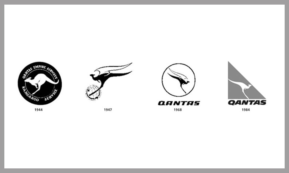
The flying kangaroo of Qantas is undoubtedly one of the most recognisable airline logos in the world and a true symbol of Australia. Since its debut in 1944, the Qantas logo has undergone many essential alterations. Its original design was taken from the Australian dollar coin. The logo has seen numerous iterations throughout the years, with the most recent one being revealed in July 2007.
The usage of the kangaroo, a native of Australia, and the colour red in the design ensure that this logo will always be recognisable and symbolic of not only a company but also of the Australian people. Additionally, the logo’s continuity and simplicity are crucial to its effectiveness in staying connected to the Qantas brand.
ABC
The ABC logo, a constant on Australian television for the past 47 years, is an excellent illustration of how to create timeless design. The design is based on an oscilloscope’s waveform and has only been minimally modified to consider evolving television technology. The ABC logo’s advantages are its ideal balance, simplicity, movement-inspiring design, and other strong points.
Commonwealth Bank
The Commonwealth Bank’s logo, unveiled in 1991, is distinctive, contemporary, and aggressive. The logo, with its geometric pattern set inside a yellow diamond, stands out from the corporate identities of other banks with its strong and vibrant hues. The Commonwealth Bank logo is an illustration of a design that deviates from the norm while yet succeeding.
Landcare Australia

A group of farmers founded the first Landcare group in Victoria in 1986, marking the organisation’s beginnings. The Landcare logo, which shows two hands cupped and the outline of Australia in the centre of the negative space, clearly conveys the idea of locals making a difference to the land. Utilising negative space is one of the most admirable aspects of the design. The universal use of hands increases the brand’s appeal, symbolising that anybody may join the Landcare organisation.
Triple J Logo
The Triple J logo intends to “symbolise the free spirit and energy of youth,” and it has come to represent Australian youth culture. When the radio station changed its name from Double J to Triple J in 1991, the logo used three drumsticks to describe the station. Since its creation, the logo has undergone a minor update, with the alterations solely intended to improve the mark’s online visibility.
Sydney 2000 Olympics Logo
Michael Bryce created the winning logo for Sydney 2000 Olympics. It includes three boomerangs made in a straightforward hand-drawn style, a running athlete, and a reference to the Sydney Opera House. The logo is creative, nifty, and accurately reflective of Australian culture because it uses icons that are potent representations of Australia.
Australia Post
The Australia Post emblem is distinctive and easily recognisable within the country’s popular culture. This logo uses the letter “P” to represent the postal horn heard on vintage English post bikes. According to legend, the circle surrounding the letter “P” represents the worldwide service that Australia Post offers. One of the hallmarks of the Australia Post logo, in addition to the eye-catching colour scheme and the legible accompanying typeface, is the usage of a pictogram.
The Cat Empire Logo
Gypsy-folk band The Cat Empire, a mainstay of the Australian music scene for almost 11 years, has a distinctive visual style. The design is based on utilising a cat’s eye within a crown and is written in simple, solid and black strokes. As a result, the logo has come to be associated with the group and, in the designer’s opinion, may be used on marketing materials without any text. It demonstrates the influence and potential of an instantly recognised logo.
SBS
Based on an open, two-dimensional depiction of the world, the SBS logo visually conveys the television station’s global perspective. Ken Cato meticulously planned the logo’s angle to correspond to the angle at which the earth tilts. The SBS text was moved from inside the logo to the outside in 2008 so that the icon could exist with or without the text. The new design is now slightly more simplified. The SBS logo is one colour, straightforward, and incorporates symbolism to express the station’s overarching goal.
Quiksilver
One of the biggest surf clothing producers in the world and a titan of the outdoor sports sector is Quiksilver. Combining a cresting wave and a snow-covered mountain, the design represents excellence and honesty. The Roxy women’s collection from Quiksilver effectively included the Quiksilver logo’s mirrored version, which forms a heart shape. The Quiksilver logo is a straightforward but effective design that beautifully represents the company’s origins and core values.
Conclusion
As we can see, all the logos are legible, simple, and have a meaning, making them easy to remember. Minor detailing in a logo, such as color, font and symbols, makes a huge difference, and to create an effective logo, you need a professional design agency. BrandVillage is the most trusted logo-designing agency in Melbourne. They have highly experienced and creative designers that work alongside you to deliver the best logo in a given timeline.
Also Read: 6 Ways To Improve Your Brand Identity

