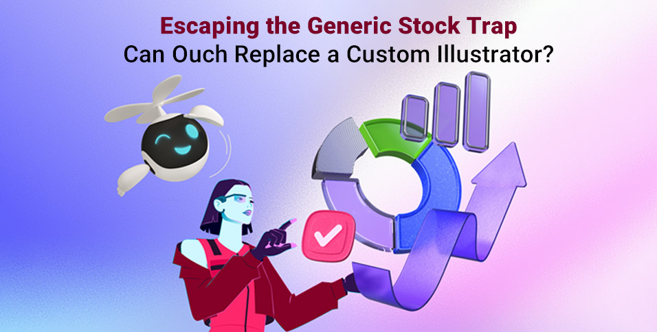
Every design project hits the “visuals bottleneck.” You have the wireframes, the copy is solid, and the layout works. Then you get stuck. You are trapped between two extremes: hire a custom illustrator, which drains the budget and timeline, or resort to generic stock vectors that make your product look like a template.
Product teams face a simple choice. Build a coherent brand system or settle for disjointed assets.
Ouch by Icons8 positions itself as the middle ground. It isn’t just a collection of images; it’s a library of design systems. It offers vector, 3D, and animated assets grouped by consistent artistic styles. After using Ouch on several interface and content projects, the verdict is clear. It doesn’t replace the storytelling nuance of a dedicated artist, but it solves the consistency problem plaguing most stock sites.
Systematizing Visual Language
Sites like Freepik or Shutterstock fail on continuity. You might find a great isometric server icon, but you will never find a matching user avatar or payment success screen in that exact style.
Ouch works differently. It organizes 28,000+ business and 23,000+ technology illustrations into specific “styles”-currently over 101 of them. Choose a style like “Surr” (surrealism) or “Scribble” (hand-drawn look), and you can map out an entire user journey without breaking visual continuity.
Scenario 1: The SaaS Interface Overhaul
Take a team building a fintech dashboard. They need visuals for empty states (no transactions yet), error messages (server down), and onboarding tooltips.
A designer starts by filtering for “Finance” or “Business” categories. More importantly, they lock in a specific style, say “Business 3D.” Instead of finding disjointed images, they find a set where the lighting, render quality, and color palette match perfectly.
For the “No Transactions” screen, they download a 3D wallet illustration. Since the team is on a paid plan, they grab the high-res PNG or the object file. Later, for a 404 error page, they locate a confused character in the exact same rendering style.
Here is the kicker: the brand color is purple, but the asset is blue. The designer uses the built-in recoloring tools before downloading. The assets feel native to the interface rather than pasted on. The result looks bespoke, despite relying on pre-made files.
Scenario 2: The Content Marketing Engine
Marketing teams face a different pressure: volume. Social media managers publish daily. Waiting for a designer to draw a new header image for every blog post is impossible.
In this workflow, the marketer opens Ouch’s Mega Creator integration. Suppose they are writing about “Remote Work Burnout.” They find a vector illustration of a person at a desk. But the default image shows the person smiling. That doesn’t fit the serious topic.
Using the editor, the marketer swaps the facial expression. They can even replace the entire character while keeping the background elements (desk, plants, window). Rearranging the composition leaves space for text overlays. Treating illustrations as layered objects rather than flattened JPEGs changes the game. The marketing team generates unique assets in minutes, maintaining the brand’s visual style without drawing a single line.
A Tuesday Morning Workflow
Here is how this ecosystem fits into a real sprint.
A product designer is working on a “Success” modal for a mobile app. They open the Pichon desktop app, which syncs with the Ouch library. The goal is to make the success state feel rewarding. They filter by “Animated” and find a checkmark animation in the “Color” style.
The client wants the animation to be interactive. So, the designer downloads the Rive or Lottie JSON format instead of a static GIF. They drop the JSON file directly into the code.
Later, they need a static icon for a print flyer. Returning to Pichon, they find the same checkmark and drag the vector version onto their canvas.
While browsing for assets to use in a premium subscription banner, they might search for specific textures, perhaps even gold clipart to add a luxe feel to the layout. Because the library allows searching by object tags, finding these specific elements is fast. Combining them with existing character illustrations in the Mega Creator ensures the “premium” elements don’t clash with the main character style.
Beyond Static Vectors
The platform isn’t limited to 2D vectors. The inclusion of 3D styles is particularly relevant as “claymorphism” and 3D web elements remain popular. The library provides these as PNGs for quick use, but often includes source files (like FBX) or MOV files for 3D animations.
For developers and interaction designers, the focus on Lottie and Rive formats is a major advantage. Motion is usually a pain point; you need a motion designer to rig and animate vector assets. Ouch provides these pre-animated. A developer can implement a “loading” state animation that matches the static “error” state illustration perfectly. That consistency matters.
Comparison with Alternatives
Ouch vs. Undraw/Humaaans
Undraw and Humaaans are fantastic open-source resources. But their ubiquity is their downfall. Because they are free and easy to access, they appear on thousands of startup landing pages. Using them signals “bootstrapped” immediately. Ouch offers distinct, artistic styles that are less recognizable as “stock.”
Ouch vs. Freepik
Freepik has a massive volume, likely larger than Ouch. But Freepik is a marketplace of different contributors. Finding a set of 50 illustrations that look exactly the same is difficult. Ouch designs its styles in-house or commissions them specifically to be comprehensive systems. It is better for product design where consistency is key.
Ouch vs. Custom Illustration
Custom work is the only way to get exact visual metaphors for complex, unique product features. If your product does something completely novel, stock metaphors might be too vague. But custom illustration is slow and expensive. Ouch serves as the 80% solution. It covers standard user flows perfectly, letting you spend your budget on custom art for the 20% that truly needs it (like the home page hero).
Limitations and when this tool is not the best choice
Ouch is not a magic bullet for every scenario.
- Licensing Exclusivity: You do not own the illustrations. A competitor could technically use the exact same style and characters. If owning the IP of your brand mascot is a legal requirement, hire a custom illustrator.
- Specific Metaphors: The library excels at general concepts (business, tech, education). If you need to illustrate a highly specific technical concept-like “kubernetes container orchestration failure”-you will likely have to cobble together generic tech shapes. It might not communicate the concept clearly.
- Merchandise: Planning to print these designs on t-shirts or mugs for sale? The standard license doesn’t cover it. You have to contact them for specific print-on-demand licensing.
Practical Tips for Implementation
Integrate Ouch into your workflow with these rules to maintain a premium look:
- Commit to One Style ID: Do not mix “3D Fluffy” with “Vector Line.” Pick one style and stick to it religiously across your app and marketing.
- Use SVGs for Web: On a paid plan, always use SVGs for icons and web spots. They scale infinitely and are editable via CSS.
- Leverage the Editor: Never use the complex scenes exactly as downloaded. Use the Mega Creator to remove one background element or change one color. This slight modification makes the illustration look custom to your brand.
- Check the UX Coverage: Before falling in love with a style, check if it has the functional states you need (404, login, success). Most Ouch styles are built with this in mind, but verify before you start designing.
Ouch bridges the gap between the chaos of generic stock sites and the high cost of custom agencies. By focusing on consistent styles and editable formats, it helps teams build design systems that look expensive, even when they are pulled off the shelf.