A clear glass bottle on a cream plinth could take a fragrance brand in several different directions. Add a dark background and it may feel formal; add a pale stone surface and it may feel softer. For a hypothetical small brand preparing its first visual presentation, I would begin with those choices before spending time on a complicated campaign scene.
The proposed deliverable would be a pair of static product-image concepts built around the same bottle and packaging references. One would be a clean studio arrangement, and the other would introduce a subtle botanical shape. Both would help the founder decide how the product should look in a presentation, while the actual bottle and label remain the factual reference.
I would first gather a straight-on bottle photograph, a three-quarter view, and a clear image of the box. Each would reveal a different part of the product: the label’s position, the cap’s proportions, and the packaging colour. I would avoid using a competitor’s campaign as the main visual reference because the new brand needs its own direction.
With Nano Banana 3, I would explore the composition through reference images and natural-language edits. The work would stay focused on image generation and refinement. A beautiful rendering would not establish the fragrance’s ingredients, packaging materials, or manufacturing readiness; those details would come from the brand’s verified information.
Decide what the bottle should communicate
For this imagined project, the bottle would be small and rectangular, with a pale label and a simple dark cap. I would want the first picture to communicate clarity and restraint. The glass edges should be visible, the label should have enough contrast, and the box should support the bottle rather than become the main subject.
The background would be a warm off-white with a gentle tonal change. That would allow the transparent bottle to remain visible without introducing a dramatic colour that competes with the packaging. A low plinth could raise the product slightly, but I would keep its shape simple and its surface matte.
My first Nano Banana 3 brief would ask for a still studio concept using the supplied references, preserving the bottle’s broad proportions, cap shape, and label placement. I would specify soft side light, a restrained shadow, and no additional branding. The prompt would describe a physical arrangement rather than a string of vague luxury adjectives.
Build a composition around two objects
The bottle would sit slightly forward of the box, with enough space between them to keep both outlines clear. I would turn the box a little to show its depth while keeping its front understandable. The bottle would face the viewer more directly so that the label remains the visual centre.
I would leave open space above and beside the pair for later layout. That area could hold a presentation heading, but I would add the wording separately after choosing the image. The concept should remain useful if the founder changes a product name or a launch date during development.
If the first draft looked flat, I would adjust the light direction before adding props. A clearer highlight on the bottle’s edge might be enough to create depth. More objects would introduce new questions about symbolism and product ingredients, so I would use them only when they serve a specific idea.
Correct product details before choosing a mood
Suppose the image lengthened the cap and shifted the label towards the bottom. I would use Nano Banana 3 to request a targeted correction based on the reference. I would ask to retain the background and light while restoring the cap and label proportions, then compare the revised result with the original photographs.
The glass would need its own review. A distorted base or an impossible reflection could make the bottle appear unlike the real object. If the generated image continued to change important details, I would keep it as a lighting reference and use an actual product photograph for the final commercial asset.
Small label text would be checked independently. I would not rely on a generated image to supply accurate ingredients, volume, or required packaging wording. For this visual study, a clean label area could be more useful than a close imitation of fine print that becomes incorrect on inspection.
Introduce one atmospheric variation
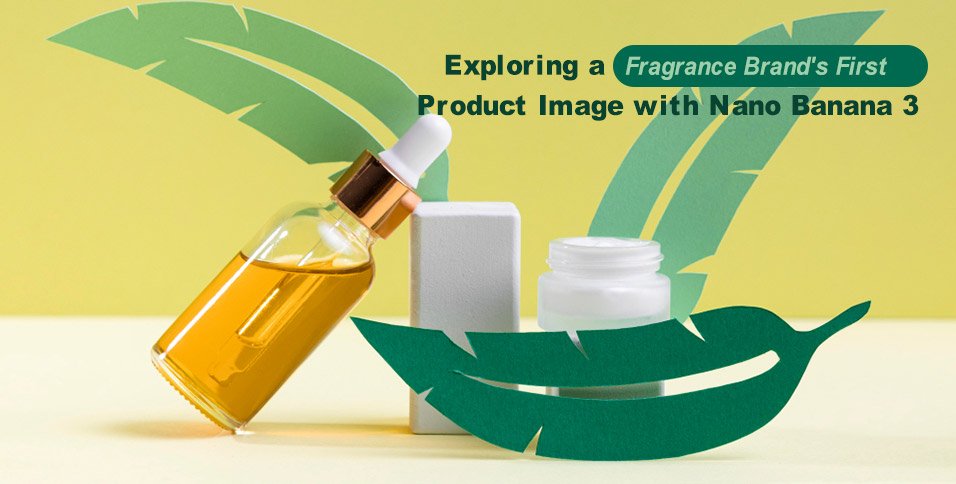
The second concept would add a soft leaf-shaped shadow across the background while keeping the product unobstructed. I would use Nano Banana 3 to explore that change without adding a pile of flowers around the bottle. A single shadow could suggest a botanical mood while leaving the packaging easy to see.
I would make clear within the presentation that this is an artistic direction, not evidence of a fragrance ingredient. If the brand wants to show a particular plant as part of its product story, it would need to verify that relationship. The image should not quietly imply a formulation claim through decoration.
Comparing the clean and atmospheric versions would give the founder a concrete choice. Does the product look clearer against an uninterrupted background, or does the shadow add a useful sense of character? I would keep the camera angle and object spacing similar so the comparison remains focused.
Budget for a small number of deliberate revisions
Before expanding the set, I would review Nano Banana 3 Pricing to understand the current plans and credits relevant to the selected image settings. I would allow for the initial concepts and a few focused edits. I would not assume that more variations automatically produce a better creative direction.
The next Nano Banana 3 revision would follow the founder’s specific preference. If the clean version felt too clinical, I might warm the background slightly or soften the shadow. If the atmospheric version hid the cap, I would move the leaf shadow away from the product rather than make the whole scene brighter.
Those small changes would keep the discussion tied to the bottle. A useful review comment would name the problem, such as “the dark cap disappears into the shadow,” and suggest a visible adjustment. That would be easier to act on than a broad request to make the image feel more premium.
Turn the selected image into a practical brief
My final Nano Banana 3 review would compare the chosen concept with the source references and the intended presentation layout. I would check the product’s silhouette, label position, colour, and surrounding space. Any uncertain detail would be identified before the image is used beyond the internal concept discussion.
The final package would contain the two labelled still concepts, the original product references, and a short explanation of the preferred light and background. That would give a photographer or designer a clear starting point for the final asset. The value of the exercise would be a more specific visual decision, grounded in the actual product rather than an attractive but unrelated scene.