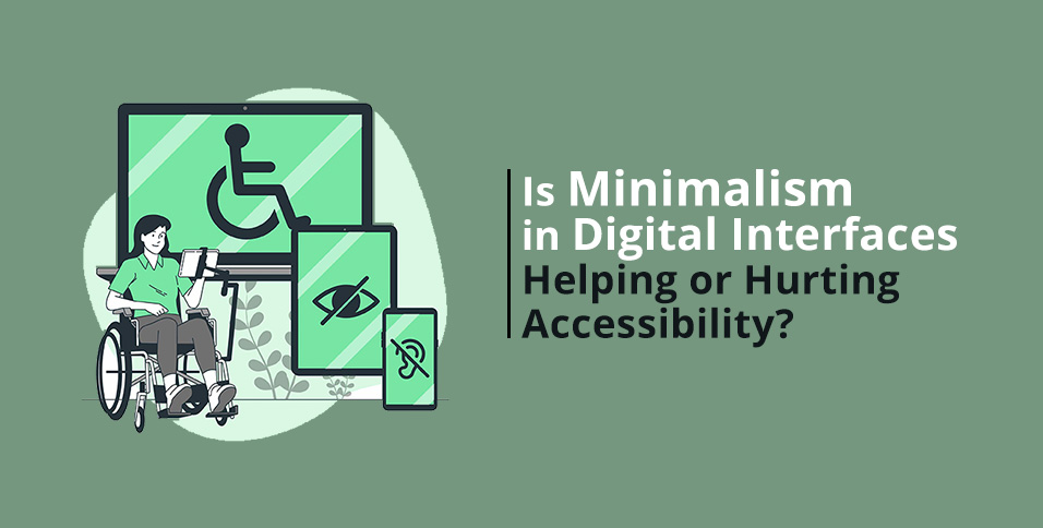
Minimalism has become the go-to aesthetic in digital design—clean layouts, lots of white space, and just enough elements to guide a user through an experience without distraction. It’s elegant, modern, and fast. But in 2025, a new question is emerging: Is this stripped-back approach helping users—or is it unintentionally leaving some behind?
As accessibility becomes more than just a checkbox and enters the core of ethical, user first design, we need to consider whether minimalism is doing what it promises for everyone.
The Rise of Minimalism—And Its Assumptions
Minimalism in interface design draws from a powerful idea: less is more. Designers cut away the unnecessary to allow users to focus on key content and call to action. This often helps reduce cognitive load, especially for users who may feel overwhelmed by cluttered interfaces.
But here’s the catch: minimalism assumes users already know how to use the interface. That assumption becomes a problem for those with disabilities, aging users, or anyone unfamiliar with certain digital patterns.
What looks “clean” to one user may feel vague or incomplete to another. Icons without labels, hidden menus, or ultra-light text on white backgrounds may win design awards— but they can alienate the people the site is trying to serve.
That’s why the top web design agencies are now balancing minimalism with a renewed focus on inclusive usability.
When Minimalism Meets Accessibility Challenges
Here are a few common minimalist design choices that can backfire in terms of accessibility:
• Low contrast: Light gray text on a white background may look stylish, but it often fails WCAG contrast standards, making it difficult for users with visual impairments to read.
• Icon-only navigation: A hamburger menu or gear icon might seem intuitive—until a new or neurodivergent user doesn’t recognize what it means.
• Hidden instructions: Minimal designs sometimes leave out form labels or usage guidance, assuming users will “figure it out.” That’s a big problem for screen readers or users with cognitive disabilities.
• Hover-only interactions: Relying on hover states for key actions doesn’t translate well to touch devices or screen readers, limiting access.
Minimalism, when executed without accessibility in mind, risks becoming a barrier instead of a benefit.
Rethinking Minimalism: Less Clutter, More Clarity
The solution isn’t to abandon minimalism altogether. It’s to reframe it.
Good minimalist design doesn’t mean removing essential information—it means removing visual noise while ensuring every element has a purpose and supports the user experience.
Top web design agencies are leading this shift by:
• Using a clear visual hierarchy that directs attention without relying on gimmicks • Prioritizing text clarity and contrast without compromising brand aesthetics • Adding tooltips, labels, and instructions where needed, especially for forms and navigation
• Ensuring keyboard navigation, screen reader compatibility and responsive touch support are baked in from the start
This isn’t just ethical design—it’s smart design. Accessibility improvements often lead to better UX for all users, not just those with disabilities.
The Business Case for Inclusive Minimalism
There’s also a powerful business incentive here. Websites prioritizing accessibility reach more users, reduce bounce rates, and increase conversions. They also reduce legal risk as accessibility lawsuits become more common globally.
When a brand invests in inclusive, minimalist design, they’re not just making a visual statement—they’re opening doors to wider markets and showing users they care.
That’s why businesses looking to update their digital presence often turn to top web design agencies that understand how to balance aesthetics with accessibility. These firms know that inclusive design isn’t a constraint—it’s a competitive advantage.
Minimalism doesn’t have to be exclusive. When done thoughtfully, it can be one of the most powerful tools in creating accessible, welcoming digital experiences.
The challenge for 2025 and beyond isn’t whether to use minimalist design—it’s how to use it in a way that includes everyone. And that’s a challenge worth accepting. The top web design agencies already are.
Also Read: Modern Digital Design: Product, App, and Website Solutions by Phenomenon Studio